
There are three basic things you need to think about regarding color: the color wheel, color harmony, and the context of how colors are used.
The Color Wheel
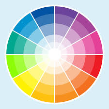
A color circle, based on red, yellow and blue, is traditional in the field of art. Sir Isaac Newton developed the first circular diagram of colors in 1666. Since then, scientists and artists have studied and designed numerous variations of this concept. There are three primary definitions based on the color wheel:

Red, yellow and blue. A primary color is a color that cannot be made from a combination of any other colors. All other colors are derived from these 3 colors.
Secondary Colors
Green, orange and purple. A secondary color is a color created from a combination of two primary colors.
Tertiary Colors
Yellow-orange, red-orange, red-purple, blue-purple, blue-green & yellow-green. Tertiary color is a combination of three colors: primary and secondary.
Description of Color
Hue – Is the name of the color itself, the dominant wavelength of light or the choice of pigment.
Lightness (brightness) – Is the lightness or darkness of the color, the amount of light reflected or transmitted.
Saturation – Is the level of white, black or grey, ranges from neutral to brilliant (pastel to full color).
Tint – Base color plus white.
Tone – Base color plus grey.
Shade – Base color plus black.
Value – How light or dark a color is.
Aggressive - AKA 'Warm'. The yellows, oranges, and reds. These come towards the eye more (spatially) and are generally 'louder' than passive colors.
Passive - AKA 'Cool'. The greens, blues, and violets. These recede from the eye more (spatially) and are generally 'quieter' than the aggressive colors.
Color Harmony
In visual experiences, harmony can be defined as a pleasing arrangement of colors, something that is pleasing to the eye. It engages the viewer and it creates an inner sense of order, a balance in the visual experience. When something is not harmonious, it's either boring or chaotic.
Some Formulas for Color Harmony:


Color Context
How color behaves in relation to other colors and shapes. Compare the contrast effects of different color backgrounds for the same red square. Red appears more brilliant against a black background and somewhat duller against the white background. In contrast with orange, the red appears lifeless; in contrast with blue-green, it exhibits brilliance. Notice that the red square appears larger on black than on other background colors.

One of the online tools I like to use is by www.scrapbook.com. You can find out which colors match a specific color or a photo you want to use. For eacg color scheme it offers different options like monochromatic, complimentary and more. (I don't get paid to recommend this, i just like it). here's an example with a photo of me.

What is your favorite color? Which colors do you like to use with it? Share with me in a comment.
Don't miss out! Keep up with all the crafty goodness by subscribing to the Einat Kessler creative newsletter
Have fun creating!

Very well explained! Thanks!
ReplyDeleteExcellent post today. Thank you for such wonderful explanations.
ReplyDelete