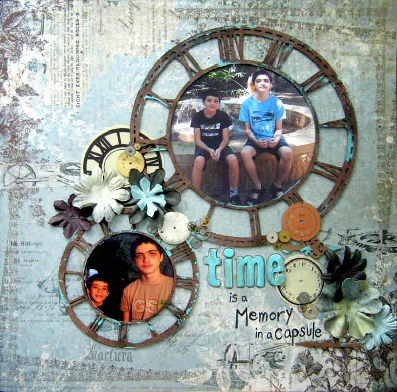
In these two layouts I did just that. The first layout is pure masculine, not a flower in sight...only gears and cogwheels with masculine colors. All the chipboards were colored and embossed in several layers using different embossing powders. I cut the photos into circles in matching sizes to the chipboard. After adding them to the layout I add some doodling with a white gel pen as well as a title.
The second layout has flowers on it. I like adding flowers to boys' layouts as long as I keep the balance and not add too many. I also try to limit myself to a masculine color scheme and avoid colors like pink.
Do you create masculine layouts?
Have fun creating!
Einat


No comments:
Post a Comment